Contents
BAD CHARTS
There are times when you inherit a confusing chart that violates all rules of “good visualization”. Your job is to diplomatically introduce a more informative chart without stepping on toes.
Your boss or bosses might have invested more then you think, in a chart they’ve used for a decade.
Example

What is this?
My initial reaction was, Huh? Let me see what we are looking at here?
I was never told what the chart is meant to solve or shed light upon, I was given the chart and was asked: “What do you think?”
Boy, talking about a loaded question.
I was not given the data at this point, if I had the data I can instantly see what the analyst was trying to explain/show/expose/enlighten. You really can’t make a judgement about a chart(s) not knowing what the analyst had to work with or was asked to do.
So, I had to read the charts and break them down and here is how it went, this was my thought process:
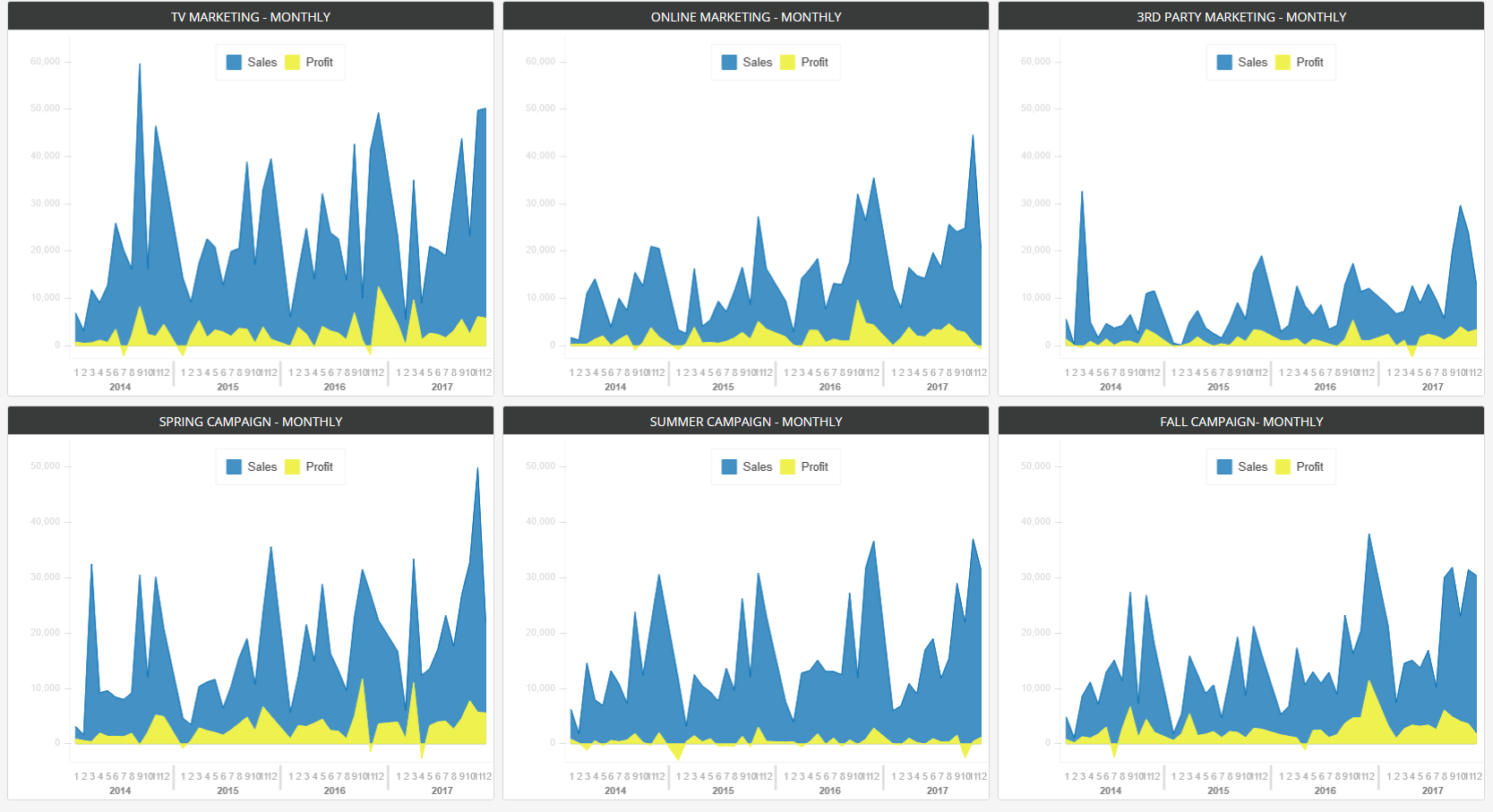
Let’s start with the upper row which shows 3 charts
- Sales/Profit over a 3 year period.
- Chart 1 appears to show TV marketing.
- Chart 2 is for Online marketing.
- Chart 3 through 3rd party marketing.
Observations & Questions
- Does the company run TV marketing constantly?
- How often does it run marketing campaigns?
- Same question regarding Online and 3rd Party.
- I’m not sure how valid the comparison is unless we run simultaneous marketing campaigns and we are trying to track their effectiveness.
- Ok so it’s obvious TV marketing yields higher sales but if you look at profits they seem to average out about the same. It would be helpful to draw a mean line for all three charts. That’s something the analyst could’ve done, regardless of what they were asked.
- If I can spot that in less than it took me to type 3 bullet points, it means it’s obvious.
- The chart should convey your message within 9 seconds.
- What I see with the naked eye is the mean profit for all three charts is about the same or extremely close.
- That in itself is a game changer and could’ve saved this company millions of dollars over the past 4 years (that’s the period on the charts).
- At this point they were all looking at me like!!??
Let’s move to the lower row
- Three charts showing Spring, Summer, and Fall campaigns.
- Same as upper row, the charts are for Sales and Profit over the same period.
Observations & Questions
- Does each campaign include any or all from the upper row?
- It appears as most spikes in Sales appear around October-December for the Spring Campaign.
- Come to think of it the same applies for the Summer and Fall Campaign as well?
- Ok now I’m confused, if sales spike from October-December each year why don’t we track the effectiveness of the Summer or Spring Campaign compared to the Fall Campaign?
- Have we tracked sales around October-December without any Campaigns at all?
- How do we know if we even need to lauch any Marketing Campaigns?
- What’s the cause of negative profits in all 3 lower charts?
WHAT’S NEXT
Well after I went through what I just laid out here, they handed me the data, and asked me if I’d be interested in reviewing it and if I’d clarify how their campaigns have affected sales and profits.
PREPARE
Well, let’s start from the beginning. What do you do as an analyst, as a product owner/manager, as a developer?
If you haven’t read any of my other notes, I suggest reading The Who – Personas, Empathy is Not an Option, Design Thinking. Basically, you need to know who are you creating the charts for? What do THEY want to see in those charts? I know what I would like to see in the charts but that doesn’t mean diddly. If I wanted to create charts for my pleasure I would do it in my spare time.
- Who will look at the charts?
- What are they looking for?
- Remember the visual you are creating should appeal to their emotions, don’t just throw colors up and call it a day.
- Tell a story, show patterns, express your findings in charts.
- At least 90% of your message should be conveyed in your chart. I say 90% because at times you will be limited on screen space, audience, medium, and many other factors and you’d have to use words to compliment your visualization.
These are the basic starting points, so focus on them and ask questions. If the client believes their existing charts are sufficient, then ask if any other charts would be helpful, for example:
- Would a chart showing “…..” help you clarify the extent of your Summer Campaign?
- Would you like to know why your Summer Campaign is more profitable than others?
- Great charts, but I do have a question for you, how do you decide to launch a specific Campaign?.
- As well as many other questions….
- Learn to ask open ended questions. Open ended questions allow your client to process and logically arrive at an answer. Maybe they’ll get what you’re driving at. It’s like leading a witness. If you ever taught a class, or raised a child, you always have to ask questions that allow them to think and find their own solution.
You will find many clients don’t know what to look for in charts, nor do they know what might be helpful, it is your job to point that out. This is where I insist that data analysts should be more of a hybrid business analyst and product/project managers as well, which I happen to be.
If a client doesn’t instruct you to create other charts, and you take the initiative to create additional charts, don’t expect to be paid for it, especially if they decide not to use the charts and you’re on an hourly contract.
I usually see something worth pursuing and I do it on my own time knowing full well that if the client didn’t like, they are not obligated to pay for it. Almost every time, they’d look at the chart and say, “why are you holding back on us?”.
Be careful, it’s a fine line and make sure you don’t go wasting company time chasing charts when you weren’t asked to.
Revision
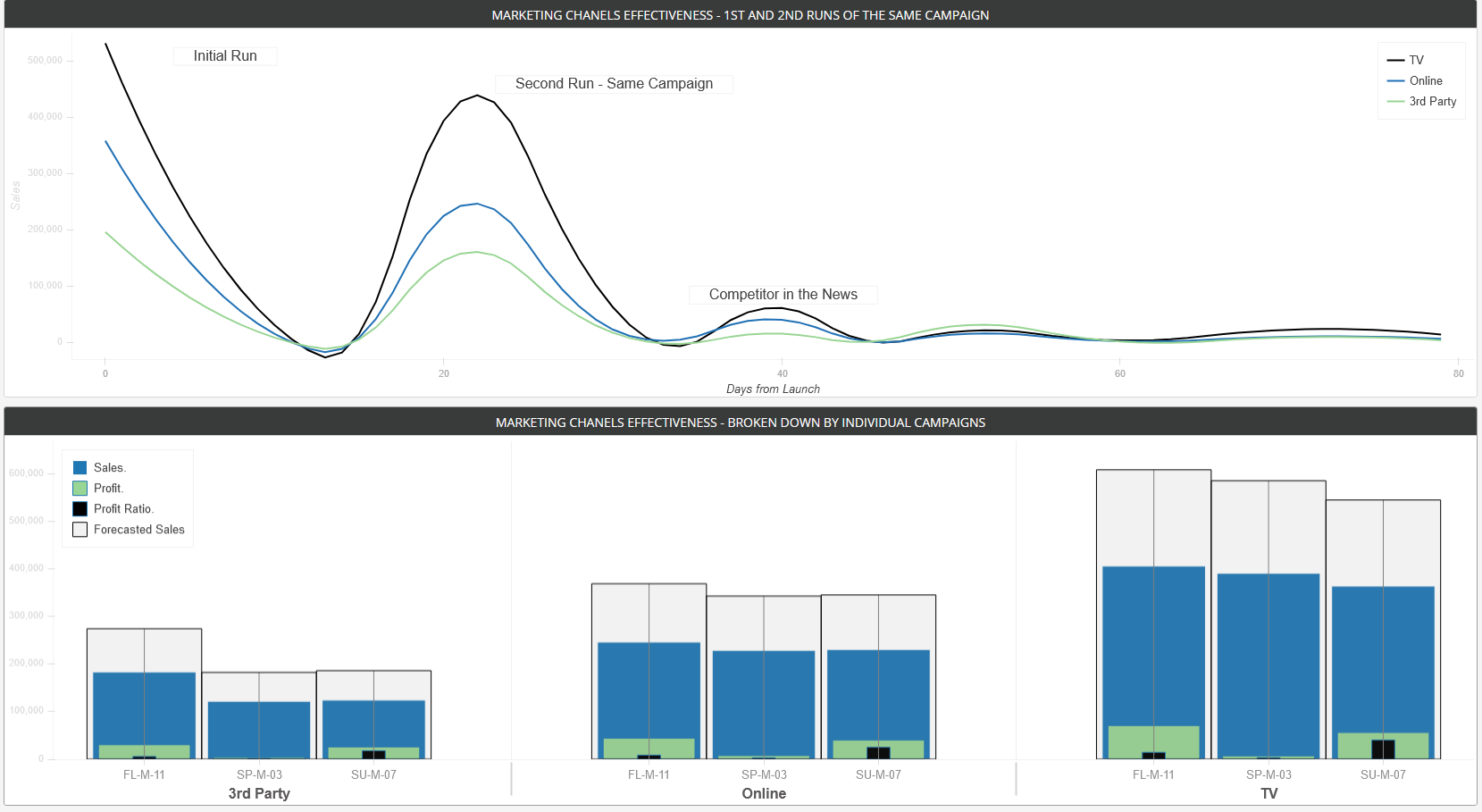
I’ve placed the revised chart underneath the original. So feel free to review the original and when you’re ready just drag THE RED TARGET on the left side of the chart to reveal the newly revised charts.
Note:
- I had to use the full screen so I can maintain the same size as the original chart that was presented to me for revision.
- I used the same colors that the client has been accustomed to for years, regardless of whether the use of other colors might be more effective (that will come at a later time)
- Looking at the charts above I was not aware of the fact that they ran the same campaign multiple times, by asking questions it became clear.
- In the top chart, you will notice a surge labeled “Competitor in the News”. I spent many years developing trading algorithms for trading commodities futures, news was an important driver of price fluctuation that I incorporated into my software. In this case I had to do back research till I found the reason for the jump in sales, they were not aware of such influences on their business, something I bring from my diversified background.
- I have to admit part 3 is very hard to track electronically and has to be done manually. You will never know when your competitor will be in the news, or when will outside factors affect your business.
- Of course, now with web crawling, APIs and a bit of hard work you should be able to track positive and negative influences on your bottom line.
- This chart makes you wonder what would happen if they’d run the same campaign the third time, or fourth.
- Can they secure a discounted rate if they ran it 4 times let’s say, and how will overlapping one campaign over the next affect sales.
- The lower charts show Profit and Profit Ratios side by side for all channels, which makes it easier to decide where to spend their marketing budget.
The charts were adopted into their dashboard and my efforts were rewarded.
I hope this brief simple demonstration helped you realize that words are not the only means of communication. If you believe your hunch is right and you have something that brings value to your client/company, invest your personal time and contribute. Your efforts will not go unnoticed.
 BEFORE
 AFTER
AFTER